
Nestlé Yaos
Building distinction in Greek yogurt
The Challenge
YAOS was relaunched to establish a clearer and more distinctive positioning in a category defined by highly similar visual codes. Built around the promise “The most pleasurable and pure Greek yogurt,” the challenge was to define a meaningful point of difference and translate it into a unique packaging system able to stand out on shelf while creating recognisable assets for the growing range.
Strategy
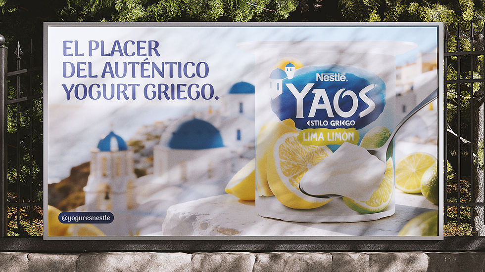
The strategy anchored YAOS in the idea of purity and pleasure, positioning it as the most pleasurable and pure Greek yogurt. Greece became the emotional origin of the brand, providing a clear visual and narrative framework. Light, white and blue shaped a simple, recognisable system designed to express freshness, creaminess and appetite appeal while standing out in a crowded shelf environment.

Design
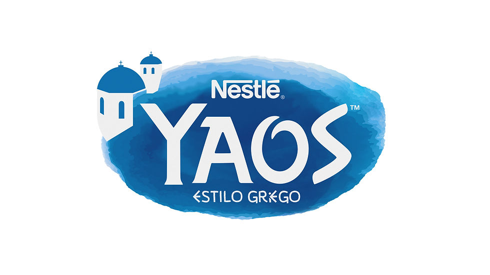
The YAOS logotype reflects its connection to Greek
origin and the idea of purity associated with the product.
The blue background introduces freshness and depth, evoking both the creaminess of the yogurt and its place of origin.



Architectural references add a recognisable cultural cue,
resulting in a clear and approachable identity designed to communicate naturalness and enjoyment at first glance.
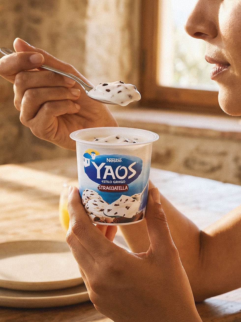
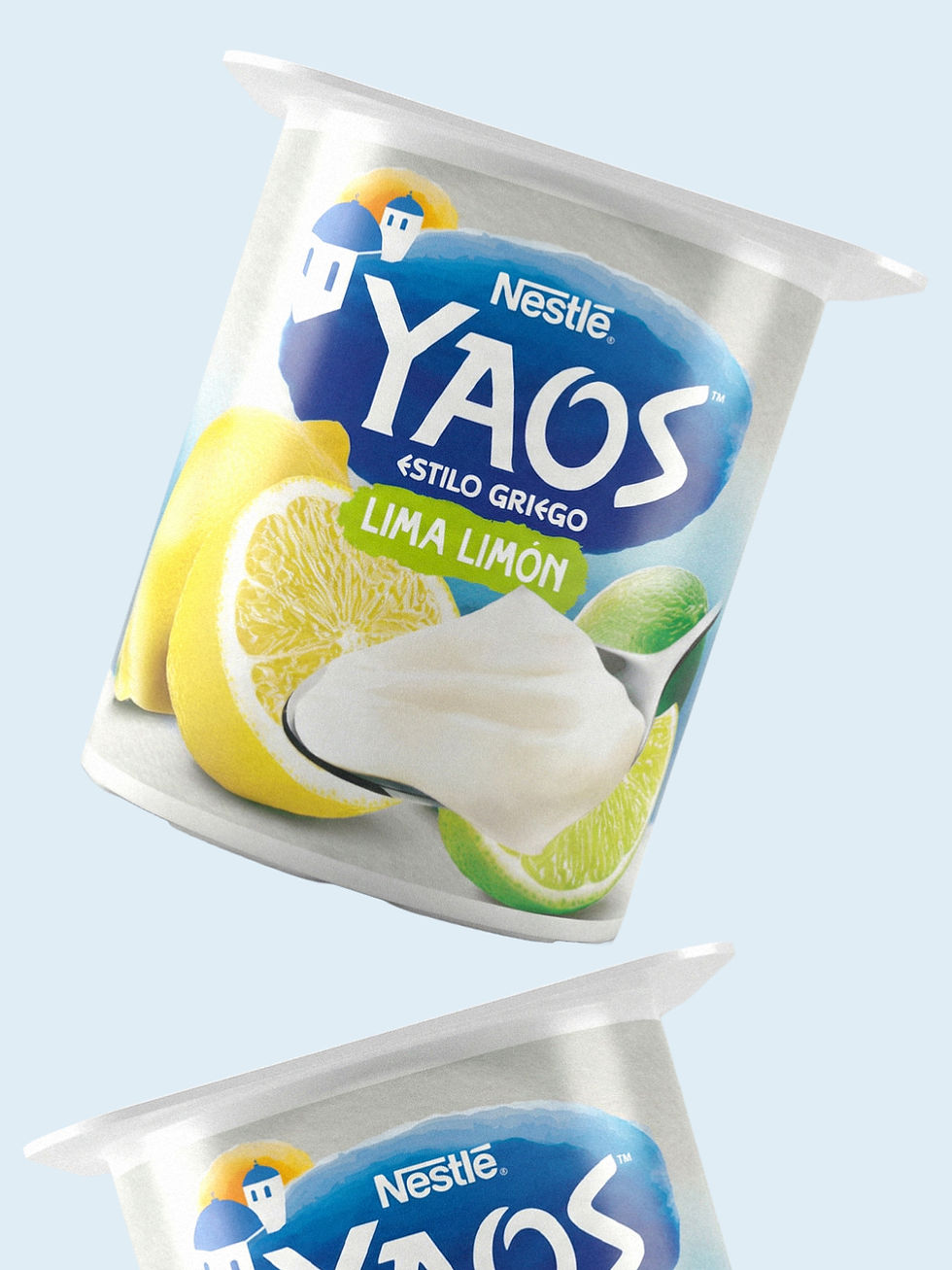
The YAOS packaging design translates the defined visual territory into a direct product experience. Dominant white reinforces the idea of purity and creaminess, while blue connects to the Greek origin and brings freshness to the shelf. Each flavour is identified through a clear, appetising image that adds nuance without breaking the system. The result is a balanced range, easy to recognise and designed to express quality, naturalness and pleasure at first glance.




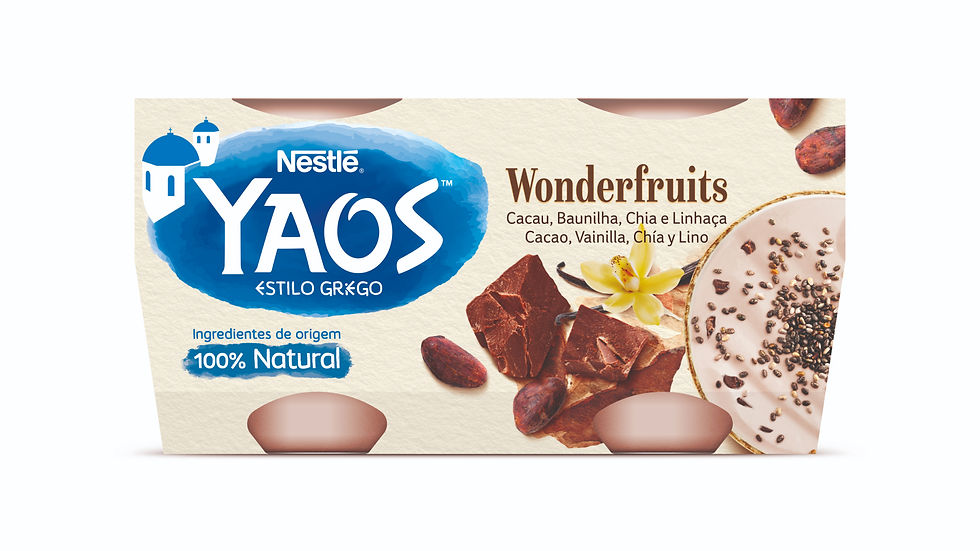
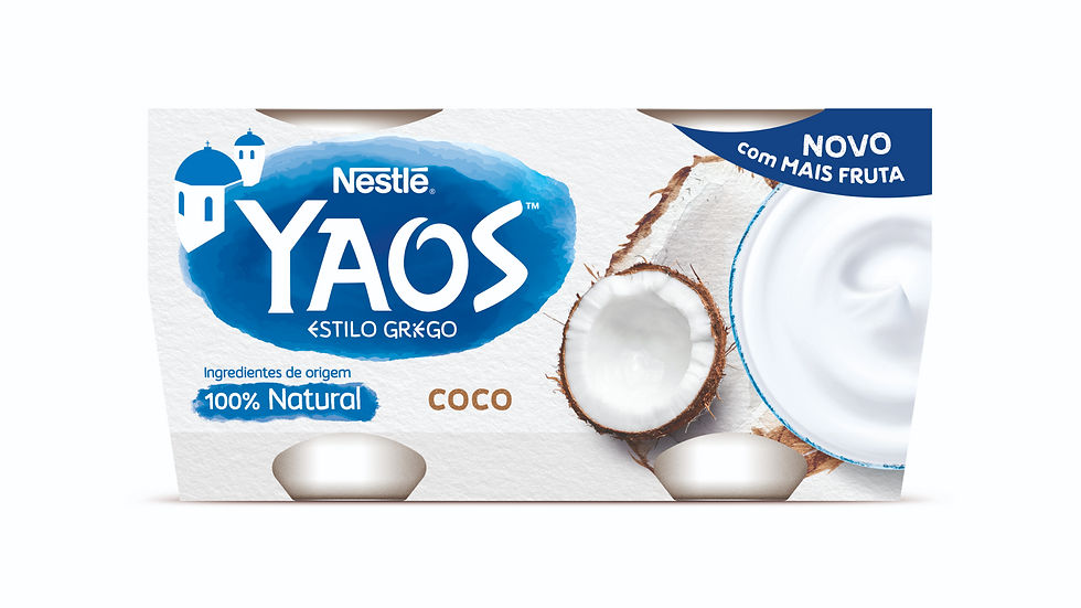
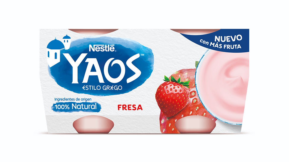

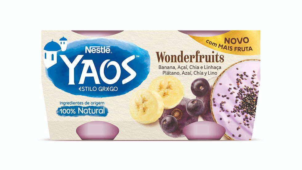

The YAOS flavour range is organised around a balance between variety and unity. Each variant introduces its own sensory cue through colour and ingredient imagery, making flavours easy to identify on shelf while enhancing appetite appeal. At the same time, a shared base maintains visual coherence across the range, allowing new flavours to be added without losing recognition or consistency.


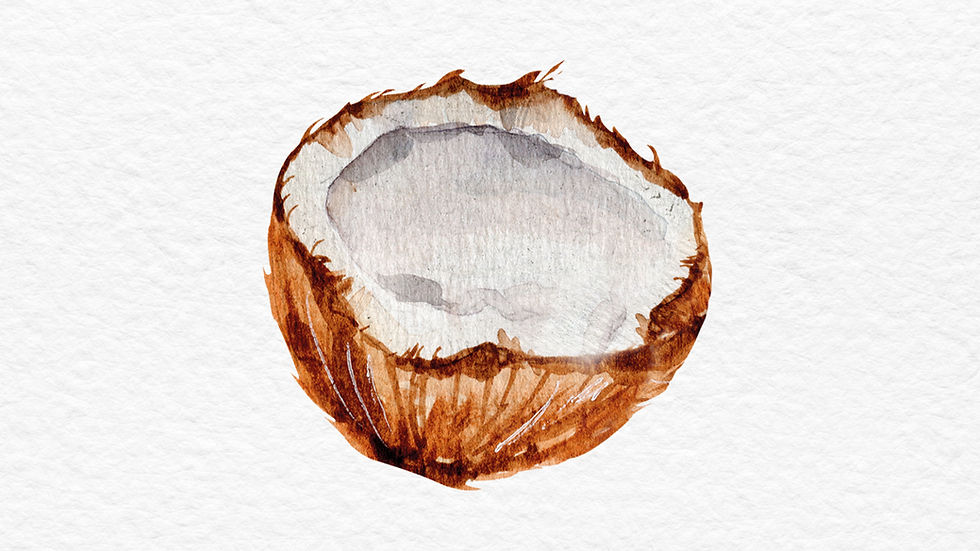


The system moves away from overly artificial category codes. Each flavour develops its own identity within a coherent whole, creating a more sensory and honest expression aligned with the character of YAOS.
Related project

