
CF Badalona
Escapulats des del 1903
The Challenge
CF Badalona had more than 120 years of history behind it, but over time the club had grown apart from the city it represents. It had lost part of the language and symbols that once made people feel it truly belonged to Badalona. The opportunity was not to rewrite its story, but to reconnect it with the city: its sea, the fire of the Dimoni, and the shared pride of everything that makes Badalona unmistakably itself.

Strategy
The strategy started from a simple belief: CF Badalona's history isn't a constraint, it's its greatest asset. Rather than reinventing the club, we focused on recovering what was already there and making it matter again. That meant looking to the city itself: its people, the sea on its doorstep, the fire and ashes of the Dimoni. Together, they shaped a way of speaking that felt true to Badalona, restoring the club as not just a football team, but a shared source of pride for the city.

Design
The crest was refined, not reinvented. Changing a football badge is never a minor decision, so every change had to earn its place. We simplified the structure, improved its balance and made sure it worked clearly at any size, from a phone screen to a kit or a stadium wall. The gull, the club's defining symbol, was redrawn with cleaner lines and stronger proportions, giving it the confidence to stand on its own.


The visual system drew directly from Badalona and the club's own symbols. Waves and the scapular became its foundation, while secondary patterns referenced the Dimoni, the Mono, the chimneys, Anís and the seafront. Together, they created a flexible language that rooted every communication in the city it represents.


The photographic treatment reinforces the same idea running through the project: the past as a living reference. Images are treated with a raw, high-contrast duotone that recalls old match programmes, fanzines and local club print. It brings the brand closer to a more direct era of football, while keeping a consistent visual system across all formats.


A voice
built in type
The system brings together graphics, pattern and copy into one idea: a brand that speaks like Badalona, direct, proud and rooted. Pilat supports it all, shifting from tight and intense to open and commanding depending on the message.


A modular grid system ensures the identity works across everything the club produces, from posters and line-ups to social and stadium signage. It keeps a clear structure in any format while letting each piece adapt and feel natural without losing consistency.

Activation
The identity came to life across communications and merchandise built around the claim “Escapulats des del 1903”. It links the club’s present with its origins and speaks to Badalona with a sense of pride and belonging. A commemorative stamp, centred on the founding year and framed by the scapular shape, adds a mark that feels both historic and wearable.


Where
the brand
lives
A football club brand only works if it holds up where the game is lived. The identity was built to move across stadium, streets and matchday comms, with special care on how the crest sits on the kit. It lives on the pitch, in the stands and in Badalona.


Graphic elements come through most clearly in the club’s merchandise. Patterns, type and tone come together in pieces rooted in Badalona, worn by people who already live “Som foc, som mar”. Not just a badge on clothing, but the story behind it.


A crest
that belongs
to the city
The crest and visual system were designed for life beyond digital, on concrete, fabric and the terraces. Every use reinforces the same idea: CF Badalona isn’t just history, it’s a club back in its city, and a city back in its club.

“The best partners to take this big step forward. Congratulations on the work done, on the result, and on the very positive feedback received. Thank you for betting on CF Badalona with such passion and dedication.”
Marc Serra
owner of CF Badalona


The visual system adapts across digital formats without losing recognition or hierarchy. It stays consistent in different sizes and proportions, keeping communication clear across digital touchpoints and social media.


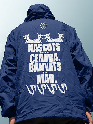
The identity works across every club touchpoint, from the website and training ground to matchday content and the jacket worn by lifelong fans. When it shows up like that, the job is done.

Related project

